Wednesday, 11 January 2017
Designing the story (Ill 2001M, SWIM!)
These are some of my design ideas for my graphic novel, I initially imagined the chapter being somewhere in the middle, but as it developed the tone and pacing (especially at the beginning) seem to make it seem almost better suited to being a prologue.
Which Colour? (Ill 2001M, SWIM!)
After finishing the design I transferred the face onto photoshop and recreated it there. This way I could easily see the variety of colours available to me. I quickly decided to have my colour incorporated in my characters design in order to draw focus to her, rather than the flood itself. I felt like the possibility of having black hair would allow me to utilise colour elsewhere, but I decided she could possibly blend in with the background. Yellow was the opposite, drawing attention but also being fairly garish. The only perk of red seemed to be that it could be utilised in blood but the feature barely factors into this chapter. Therefore I chose orange because it balances drawing attention, without being too bright.
Tuesday, 10 January 2017
Designing the Lead (Ill 2001M, SWIM!)
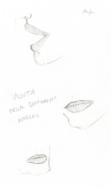
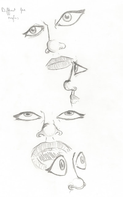
When I began designing the lead character I first drew what my first thoughts of the character were. After that I quickly realised I had to build on it, she was very generic and I hadn't gotten to the point where she was recognisable from other angles. After that I started practicing drawing her features in different angles and emotions, refining her characteristics and style.
Transformation (Ill 2001M, SWIM!)
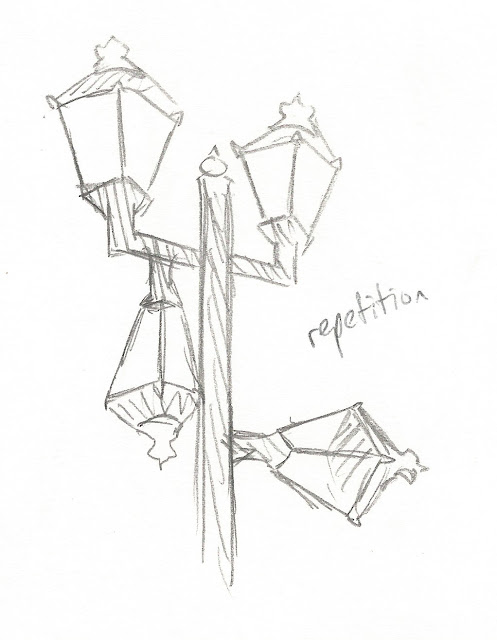
When designing the transformation I decided to focus on one of the lampposts in the high street. I felt like this let me have a variety of options in terms of transformation. Although I like the repetition transformation, and have considered one that changed the size, I decided to focus on the monsters because I want one to play a role in the story. I preferred the second design, the first felt too cartoony and very similar to Kang and Kodos from 'The Simpsons. I then decided to change the hands of the design so they maintained their lamp design rather than the fire that the first had, it feels simpler and more focused than designing the fire.
Around Town (Ill 2001M, SWIM!)
Because our graphic novel has to be based around Lincoln I went out and drew some sights around Lincoln. I particularly looked around the high street because I feel like I could tell a fairly linear story based around that location
Influences (Ill 2001M, SWIM!)
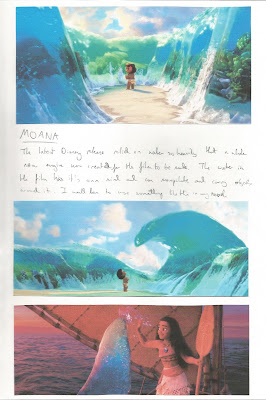
Before starting any designs for my graphic novel, I gathered examples of media that displayed water being used in different unusual ways. This ranged from literature and art to television and film. Each brings a different idea or style that could inspire my artwork or story going forward.
Subscribe to:
Comments (Atom)


